Advertising and branding in America have acted as a cultural mirror since the 19th century. Our attitudes towards race and gender have evolved since the days of sexist and racist advertising people were used to. Today we would be appalled by some of the ads that appeared in the mid-1900’s. Our sensitivity to racial injustice and sexism has grown, but the products that represent our society are still stuck in the past.
Why did companies use racial stereotypes to begin with? Many brands have long relied on a spokesperson or a mascot to represent their product. Take the myth of the happy slave as cook or butler who loves serving the white family. If you believe this misperception, then the product feels more authentic. Jason Chambers, professor of advertising at the University of Illinois, calls this “ethnicity as authenticity.”1 Depicting another culture under the guise of “honoring heritage,” like a fighting Indian warrior, is a way for us to feel comfortable with oppressive history.
Last year, America saw a racial reckoning that has been building for decades, fueled in part by the Black Lives Matter movement. Monuments and icons representing our country’s bigoted history began to fall. And finally, companies are coming to terms with their own racial missteps. Here is a rundown of a few brands that have underlying (or overtly) racist imagery as the foundation of their product’s brand image.

The Washington Football Team, formerly the Washington Redskins, was established in 1932. The term “redskin” is a racial slur for indigenous North American Indians who have long protested against the team’s use of the word. Despite these protests, the team’s owner, as well as NFL commissioner Roger Goodell, did not change the name or remove the mascot from uniforms. Goodell had even previously defended the name and the logo, calling them an homage to Native Americans. It was not until one of the team’s top sponsors, FedEx (who owns the naming rights to the team’s stadium), threatened to not pay $45 million in contract fees if the name was not changed. Other major sponsors such as Nike, PepsiCo, and Bank of America made similar demands.2 Reportedly, even Barack Obama asked the team to change the name more than once.
It would seem that public pressure and potential loss of money—as opposed to racial awareness—were the incentives for this re-brand. For this past season, the team was simply called the Washington Football Team. It’s unclear when or if a new name or mascot will be announced, however, the burgundy and gold color scheme is still intact, which serves to maintain the team’s brand recognition.

The Cleveland Indians MLB team mascot was a cartoon caricature dubbed “Chief Wahoo.” The mascot, used as a secondary logo, was essentially a Native American version of black face. It originally appeared on the uniforms in the 1948 season, but after many years of public pressure from Native American groups, and more recently from the MLB commissioner, it was finally removed in 2019. The mascot has since been replaced with the team’s original block “C” insignia, created in 1904.3 The name “Indians” stayed on the stadium facade until just this past December when plans were announced to remove and/or change the name altogether in a move to complete its transformation. The “throwback” look is trending for sports teams that are revamping their brand by up-cycling their original logos.

Now let’s talk about a few food products that are in our everyday lives. The first and biggest domino to fall was the 131-year-old Aunt Jemima brand (PepsiCo), prompting Mrs. Butterworth’s (ConAgra Brands) to follow suit, with an announcement of a complete brand and package review. Since the 70’s, there have been public calls for Aunt Jemima to remove the name and the racial imagery. The brand name originated as a minstrel song. Nancy Green, the face of Aunt Jemima, was born into slavery. She was chosen in a casting call to be the paid spokesmodel for the pancake flour brand, R.T. Davis, and later Quaker Oats.4 She would do live demonstrations and regale customers with tales of “the good ol’ south.” The character has been updated over the years to resemble the current style of a domestic housewife with lighter skin in an attempt to be “appropriate and respectful,” said Kristin Kroepfl, vice president and chief marketing officer of Quaker Foods North America, but they realized those changes were insufficient.2 They just announced the new brand name will be Pearl Milling Company. It will retain the same packaging but the woman’s portrait will be replaced with a water mill icon along with a small reminder (not pictured) that it’s the “same great taste” as “Aunt Jemima.”10
The slightly subtler issue with Mrs. Butterworth’s is the shapely figure and attire of the bottle which resembles that of a ‘mammy’ caricature. In addition, the brown color of the syrup gives the figure a skin tone that reinforces the imagery. Despite all of that, the brand claims the product name and packaging is based on a grandmother figure. They have yet to publicly present a new name or package for their product.

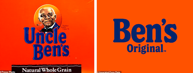
The rice product, formerly known as Uncle Ben’s (Mars Inc), announced they’re changing the name to Ben’s Original, with the new packaging arriving on store shelves in 2021. This was done in response to the sway of public opinion and immediately following PepsiCo’s announcement of plans to re-brand Aunt Jemima. Since 1921, the package featured an African American waiter and chef from Chicago named Frank Brown, who had no ties to the creation of the product.5 The terms “uncle” and “aunt” were used by white southerners as honorifics for older Black people because they refused to call them by the formal titles of “Mr.” or “Mrs.”6 The brand has always featured this figure with less prominence compared to the other human characters like Orville Redenbacher and Colonel Sanders.
The new packaging looks very similar to the original, and the typeface and bold orange and navy-blue color scheme have become more recognizable than the face on the box. On the store shelves, you’ll already know what to look for—no person required. While the Ben’s Original re-brand and packaging was relatively quick, it’s interesting to note that another large food brand had to act first before they themselves made a significant change.

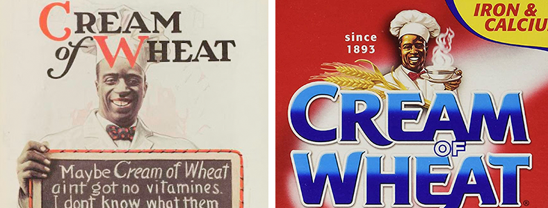
Following in these footsteps, Cream of Wheat (B&G Foods), which was founded in 1893, announced they will be removing the portrait of the smiling African American chef from its packaging which was based on Chicago chef Frank L. White. Originally, the package featured a similar looking illiterate man named “Rastus,” which is a pejorative for Black men from the post-Civil War period.7 The company wanted to ensure it did not “inadvertently contribute to systemic racism.”9

At the end of the day, we need to do more than just erase the black and brown faces from our products and jerseys. Brands need to mirror our diverse culture...
Land O’ Lakes took steps to redesign their packaging a little earlier than the aforementioned companies without any acknowledgment of the removal of the racial and misogynistic imagery.
For 100 years, the box featured a Native American woman known as Mia kneeling in a subservient-looking position in front of a lake and forest representing Minnesota.7 Minnesota American Indian groups have long called out against the objectification of native people.
The new packaging is almost identical to the previous. They simply erased the female portrait.
The older typeface was a Futura-style font while the new logo-type is custom Art Deco style lettering which has a much softer feel. The back features a statement emphasizing farmer ownership and a diverse group of people. This is a big improvement in terms of design simplification and inclusivity.
So why did this all take so long? These brands have been hard to sway. The giant corporations had the money and brand visibility to withstand public pressure up until now. Changing a brand name or trade character is a big, expensive undertaking, and these companies have already spent millions of dollars and decades establishing them. Let’s not forget that if board members are historically mostly white men, the decisions may reflect that lack of insight that diversity brings. Trust is a big factor when it comes to how people shop. More than three quarters of U.S. consumers said it is “deeply important that companies respond to racial injustice to earn or keep their trust.”8 More importantly, we need to trust a company’s leadership more than the spokesperson. The public opinion that values human life has finally began to outweigh the misconstrued business incentives.
Companies may find it easier than they thought to transition to non-racial representations. Simplification is one of the strongest design trends of recent years. Established brands with high market value and large consumer following can use minimalist design to strip their packaging of excessive details and only leave the essential colors and fonts. In doing so, they’re adding more weight to those select elements. Simplifying their visual identity in smart and racially-sensitive ways should have no effect on customer awareness. The act of reinvigorating their brand position to a more socially-just and inclusive stance could make their brands more appealing to a new generation of consumers who have a new frame of mind.
At the end of the day, we need to do more than just erase the black and brown faces from our products and jerseys. Brands need to mirror our diverse culture—and not just in terms of race, but also gender, sexuality, body shape, age, and more. We need to make room for more brands that celebrate diversity and leadership in all forms, not just in the ads, but in the boardroom as well. If you want your brand to feel authentic, then be authentic. By breaking down the stereotypes that separate us, we can build a mirror that truly reflects us.
Sources:
- https://www.theguardian.com/us-news/2020/jun/28/aunt-jemima-uncle-ben-racism-advertising-branding
- https://www.businessinsider.com/15-racist-brand-mascots-and-logos-2014-6
- https://www.nytimes.com/2018/01/29/sports/baseball/cleveland-indians-chief-wahoo-logo.html
- https://www.usatoday.com/story/news/factcheck/2020/06/30/fact-check-aunt-jemima-model-didnt-create-brand-wasnt-millionaire/3241656001/
- https://www.cnn.com/2020/09/30/business/racist-brand-mascots/index.html
- https://www.fooddive.com/news/uncle-ben-cream-of-wheat-chef-and-mrs-butterworth-all-under-review-for-ra/580041/
- https://www.smithsonianmag.com/smart-news/mia-land-olakes-iconic-indigenous-woman-departs-packaging-mixed-reactions-180974760/
- https://www.marketingdive.com/news/consumers-want-brands-to-address-systemic-racism-survey-says/584874/
- https://www.nytimes.com/2020/09/27/business/cream-of-wheat-man.html?action=click&module=RelatedLinks&pgtype=Article
- https://www.nytimes.com/2021/02/09/business/aunt-jemima-renamed-pearl-milling-company.html

No comments